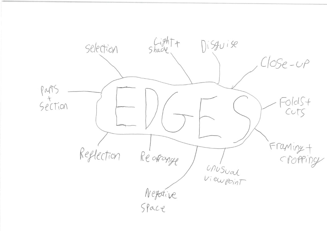
Why edges are important:
. Because it creates a frame for the photo and edges can make photos seem unreal or surreal for the audience.
. The placement of the edges can stop the audience for always thinking of questions or ideas about the surrounding visuals.
. Sometimes the edges can provide us with a first impression of the photo.
. It could also set a more creative and imaginative scene for the audience
. The positioning of the edges could create different images in the photo e.g. if you had a circle, people would not think of it as a circle they would think of it as two semi-circles


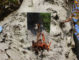
In one of our lessons we went out with our cameras and had to create unique photos with mirrors. We went out to our school fields in groups of four and created fun and unique photos. We used many different object to created our images we used things such as; trees, cameras, tables and of course mirrors. we spent around 30-40 mins of creative photo taking.
There was a time when we thought it was just enough to photograph objects at eye level but then we began to move around, to climb mountains, to soar in airplanes and drop to the bottom of the sea. An we took our camera with us everywhere, recording whatever we saw.
-- Osip Brik, 1926
-- Osip Brik, 1926
|
|
TRIP TO THE PHOTOGRAPHER'S GALLERY
On the trip we went to see the "feast for the eyes" exhibition in central London at the photographers gallery. at first we were meant to get on a train from Kidbrooke to London bridge but the trains got cancelled so it was a rocky start to get to the gallery. when we finally arrived we met a woman called Marysa Dowling who showed us around the exhibition for a good hour before we went back top the workshop at did some fun games and group work until 1:00. after that we headed to soho square and had our lunch we were there for like one hour then we started to head back to school we got the train from charing cross on the way back because it was 3:15 some people who had permission from they're parents could leave from blackheath so i did cause i lived close.
On the trip we went to see the "feast for the eyes" exhibition in central London at the photographers gallery. at first we were meant to get on a train from Kidbrooke to London bridge but the trains got cancelled so it was a rocky start to get to the gallery. when we finally arrived we met a woman called Marysa Dowling who showed us around the exhibition for a good hour before we went back top the workshop at did some fun games and group work until 1:00. after that we headed to soho square and had our lunch we were there for like one hour then we started to head back to school we got the train from charing cross on the way back because it was 3:15 some people who had permission from they're parents could leave from blackheath so i did cause i lived close.


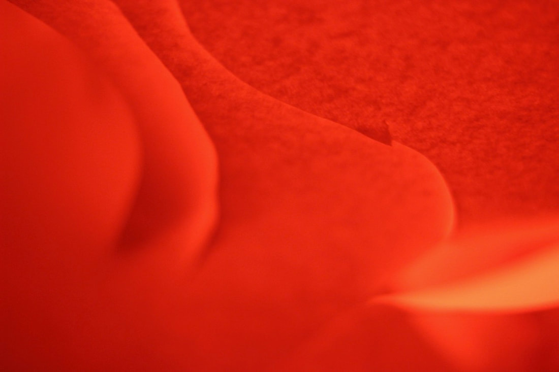
This is my favourite picture because I like how the colour of the image changed to red even though I used a red piece of paper also I like how it is such a simple and easy layout because it is only 3 cuts into the paper yet It looks so effective also this was very unique and very ambiguous. also the texture of the photo makes it look like not just paper but something like velvet or something smooth. we have created these types of images after researching a brilliant photographer called Francis Bruguiére.
What is a concertina book:
A concertina booklet is an origami-looking pop-up book. It is called a concertina booklet because the folded structure resembles a concertina which is an instrument similar to an accordion. what you do is when you get a bunch of photos and put them back to back in a book/accordion that you could fold up and unfold. also it should be able to stand up. it is a fun way to use many different photos in one project


PAPER EDGES ANALYSIS
I think that the two images were made by using a scalpel knife and cutting different shaped lines onto a piece of paper and then they put it onto a light of any kind , then with camera you focus on a certain point on the piece of paper then you move it around and try create different shades on the paper to make unique images.
In the images francis bruguiere used more curvy and smooth cuts then vjeko sager used more jagged and rough lines which made it really unique
The light in the two images were very different because in francis bruguieres image he used alot more shadow and a darker tone then vjeko sager used a lighter tone.
Three words i would use to describe francis bruguiere images would be smooth simple and dark because the image feels like it would be easy to create and simple to create the smooth lines . three words i would describe vjeko sager images would be violent, jagged and tough because it looked like it would be difficult and ver tough to cut that piece of paper.
POST-IT NOTES EDGES.


cut edges creative project
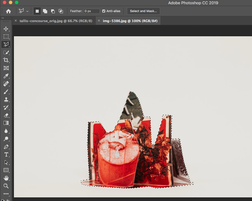
we did this by cutting out shapes from an image that we had taken before and then we went out and tried to use them as stencil and create image of the school grounds.


Edges assessment;


Edges assessment: photoshop
Step:1
choose your background and add it onto your page
Step:2
next your get your foreground
Step:3
then you get the polygonal lasso tool and use it to cut round the edges of the main image
Step:4
then you press command and c to copy the image then you press command v to print it off on onto the background page
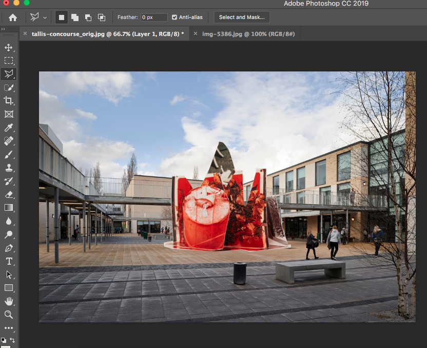
step:5
then you move the foreground image to the position on the background you want .
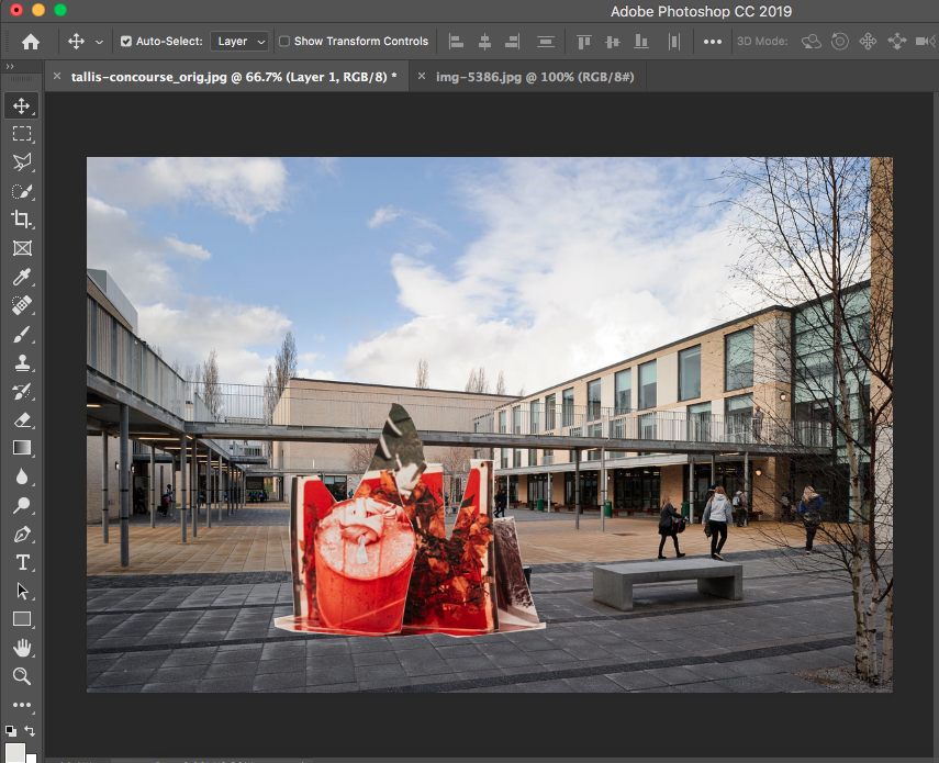
step:6
then you click on file to open the tabs below.
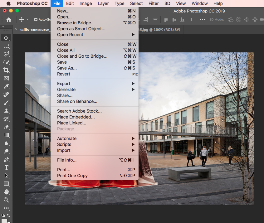
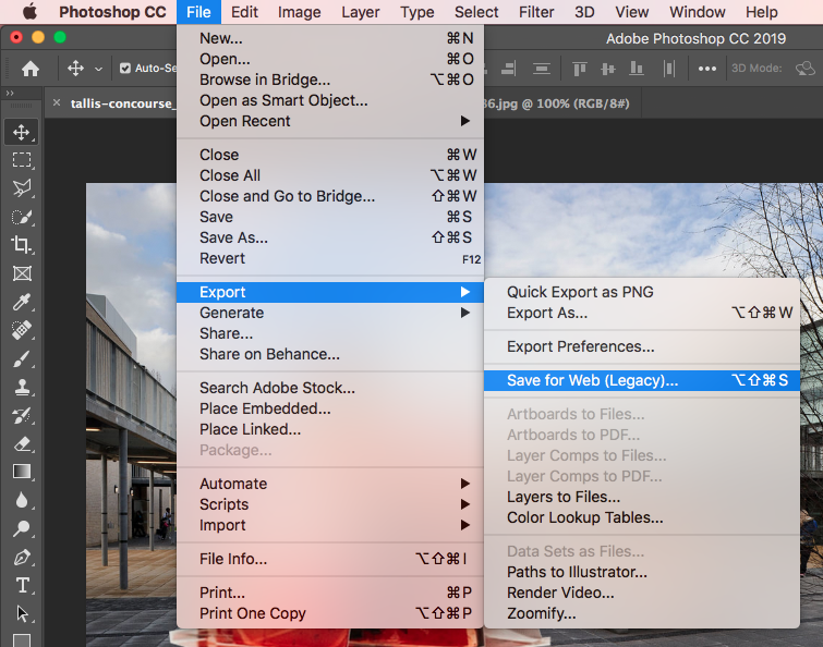
step:7
then you go to export hover your mouse over that then you press save for web click on that the name your file a name you can remember and press save
Edges assessment: photoshop 2 our turn of creating the images


Robert Frank/Lorenzo Vitturi comparison
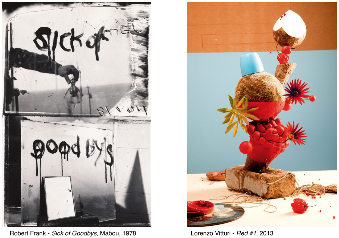
Frank's Sick of Goodbys, Mabou, 1978 is spooky, scary and horrific. This is because of the image being in black and white and the writing on the mirrors looks like it was drawn in in blood. Lorenzo Vitturi - red 1 in 2013 is colourful, sunny and fun this id because of the variety of colours used in the image. I think that the main differences of the two images is the feelings that you get when you look at both of the images. for example in the sick of Goodbys it makes me feel sad and creeped out. then Vitturi's image makes me feel happy and excited
Two questions i would ask Robert Frank would be
1) why did you use the effect of the mirrors in the image?
2) why did you spell goodbyes wrong?
two questions I would ask Lorenzo vitturi would be
1) why did you make your image very vibrant
2) why did you name your image that title
Two questions i would ask Robert Frank would be
1) why did you use the effect of the mirrors in the image?
2) why did you spell goodbyes wrong?
two questions I would ask Lorenzo vitturi would be
1) why did you make your image very vibrant
2) why did you name your image that title
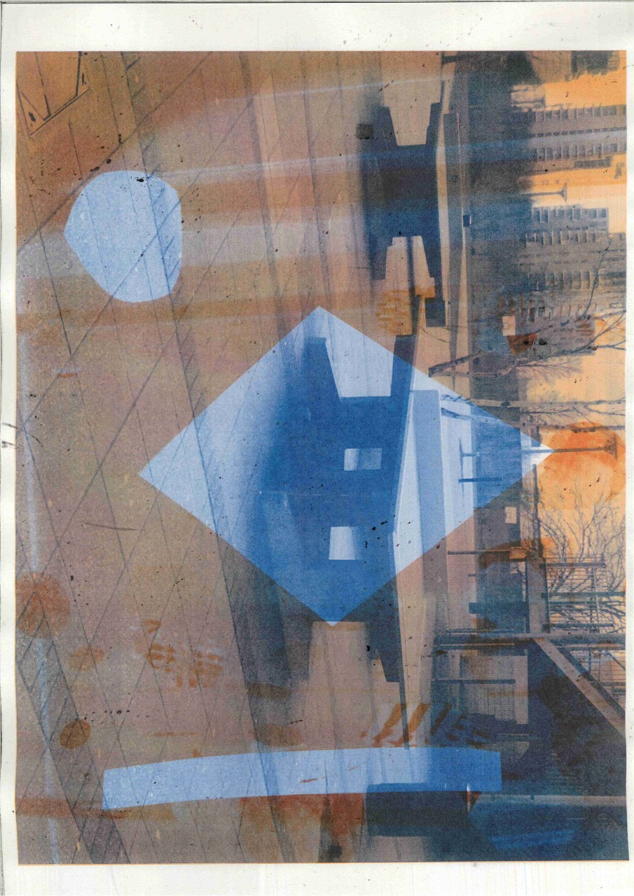
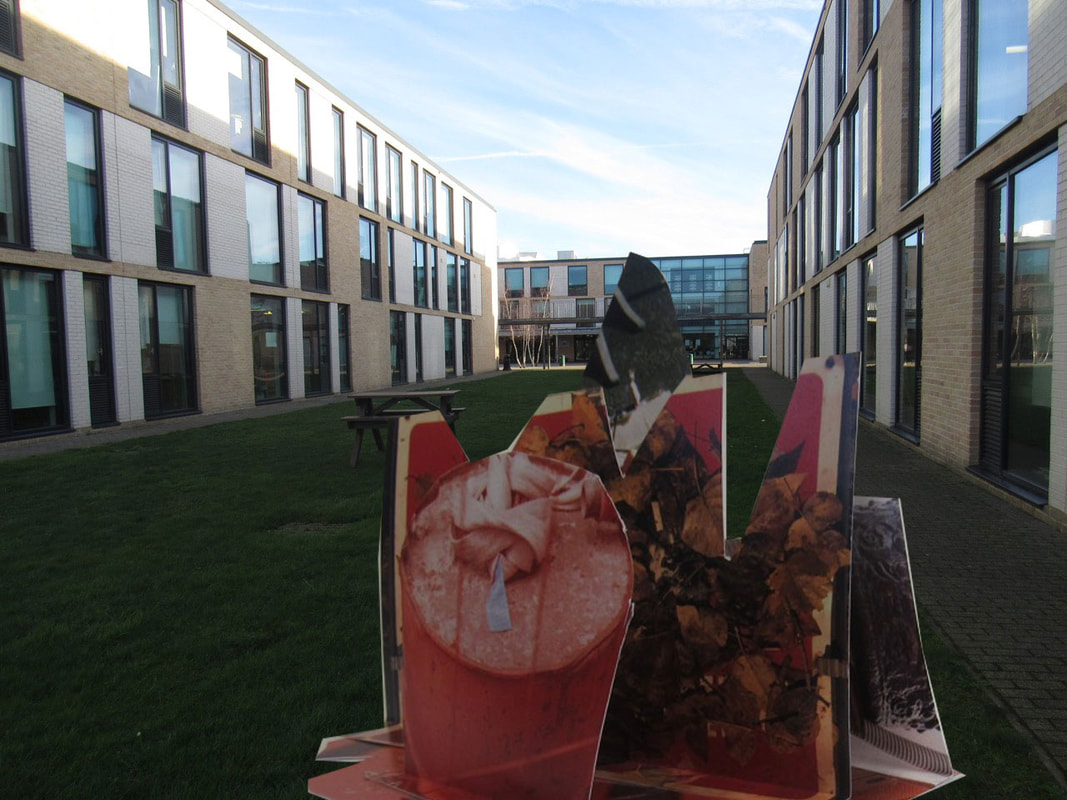
photoshop final image.
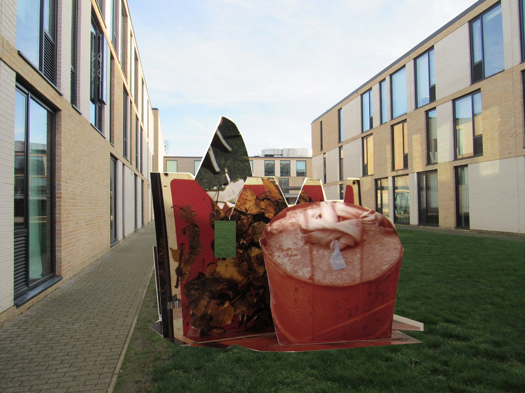
Personal projects assessment


object clipping: